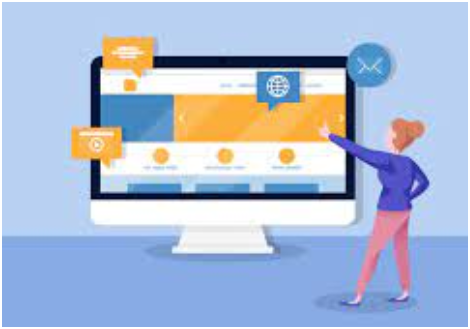
People who visit your website are looking for products, services, or information. The design of your website influences whether or not visitors do what you want them to do.
If you understand how important web design is in influencing
human behavior, you can develop a good user experience that motivates them to
stay on your site.
When it comes to initial impressions, your site's
design—including its layout, copywriting, navigation, and even the colors you
use—is everything. That is why it is critical to use crucial New Jersey website designers approaches based on psychology.
The psychology of website design involves how aspects such as
fonts, space, content, color scheme, and so on influence how users interact
with your site. Let's have a look at some web design psychology techniques and
how you can influence consumer behavior on your site.
How Influence the Shoppers and Improve Sales for psychology of web design?
Conversion rates can improve when site designs consider
marketing psychology. To do so, familiarize yourself with the needs of your
target audience and devise a strategy for incorporating those needs into the
brand page.

Marketing
psychology principles are employed by
people involved in the design, marketing, and ownership of websites in any
particular business to suit the demands of both designers and customers.
Getting a positive reaction from customers is difficult at first because they
frequently want to see proof of your dependability before giving you their business.
As a result, utilizing marketing psychology to develop credibility for your
online presence is a significant responsibility.
Here is the following technique for Influencing psychology web design:
1. The Zeigarnik Effect
The Zeigarnik Effect is a strategy of persuading people that website designers
must consider. Bluma Zeigarnik, a psychologist, says that unfinished tasks
plague people's minds.

It's vital to encourage potential customers to complete the
process, whether it's an online registration form, a product purchase, or a
profile fill-out. This is how it's done.
2. Use Colors to Influence Shoppers
Color theory is the art and science of using color. It goes
through how people see color and how different colors can trigger various
emotions in humans. Blue, for example, has been shown to instill trust and a
sense of security, which is why banks widely use it. Green is a simple color
for the eye to process, and it is frequently linked with prosperity.
This information can help you with your New Jersey website
designer. When it comes to buying, 93% of people prioritize visual appeal over
other considerations, such as sound, smell, and texture.
3. Restructure the navigation menu
Whatever your website's subject matter, the top and bottom navigation bars should always offer the most relevant links. Readers are more
inclined to look into the topics you want to highlight.
It could be the "special deals" page, the
"contact us" form, the "about us" page, a page that
describes a service or product, or a page that explains how to contact the
company.
4. Use Happy Faces to Convert Customers
How do you feel when you walk into a store, and the clerk greets
you with a bright smile? People enjoy seeing a happy face. And practically
everyone understands a grin, regardless of their culture or language.

According to a 2019 study, joyful smiles have a tremendous
motivational impact on others, influencing the recipient to interact. Consider
utilizing human faces on your website where suitable.
5. Role of Social Proof
When it comes to Internet marketing psychology, social proof is
essential and a very effective technique to increase conversion rates.
When people are in a group setting and are unsure how to
respond, social proof prompts them to unquestioningly accept and replicate the
group's collective behavior in order to decide on their options.
For example, each of our guests is unique, with their own set of
needs and opinions.
Designers may use persuasive design, which contains social
proof, to promote consumer trust in their brand.
Designers may use social evidence to help clients relax. While
this does not guarantee repeat business, it does improve your chances of
converting one-time clients into regulars.
Every business website, whether it's an online store or a
service provider, has a single purpose in mind: to encourage site visitors to
make a purchase.
This is frequently performed by using phrases like "contact
us," "learn more, "request demo," "search,"
"register," "purchase now," and so on that lead to specific
pages on the website. Make the CTA icon stand out to increase the
likelihood of people clicking on it.
6. Visual flow
The primacy effect can also be increased by emphasizing the most
important characteristics or benefits first.
Declare it from the rooftops! If free shipping or a free trial
is what sells your product to your clients, make these offerings stand out
while they browse the rest of your website.
7. Optimize Content
When creating a landing page, use the sequential position
principle to organize the material.
This gives the central topic prominence on the page, frequently
with a commercial advantage, and concludes with a call to action (CTA).
Conclusion
You can persuade customers to buy from you and return to your
online store. While building your site, it's a good idea to apply marketing strategy
psychology tactics as well as any other psychological laws that make sense.
However, you should put only some of your eggs in one basket.
Even though you're attempting to encourage your clients to do a specific
action, you must maintain sight of the reality that your ultimate purpose is to
create a site that assists people in meeting their goals.
Ensuring this is fulfilled has the potential to improve
income streams, reduce churn, and enhance conversions.
